

Crafting Wocabo’s Brand Identity
Crafting Wocabo’s Brand Identity
Crafting Wocabo’s Brand Identity
Crafting Wocabo’s Brand Identity
Crafting Wocabo’s Brand Identity
Client
Client
Client
Client
WOCABO
WOCABO
WOCABO
WOCABO
WOCABO
Category
Category
Category
Category
Branding
Branding
Branding
Branding
Branding
Date
Date
Date
Date
Our Value
Our Value
Our Value
Our Value
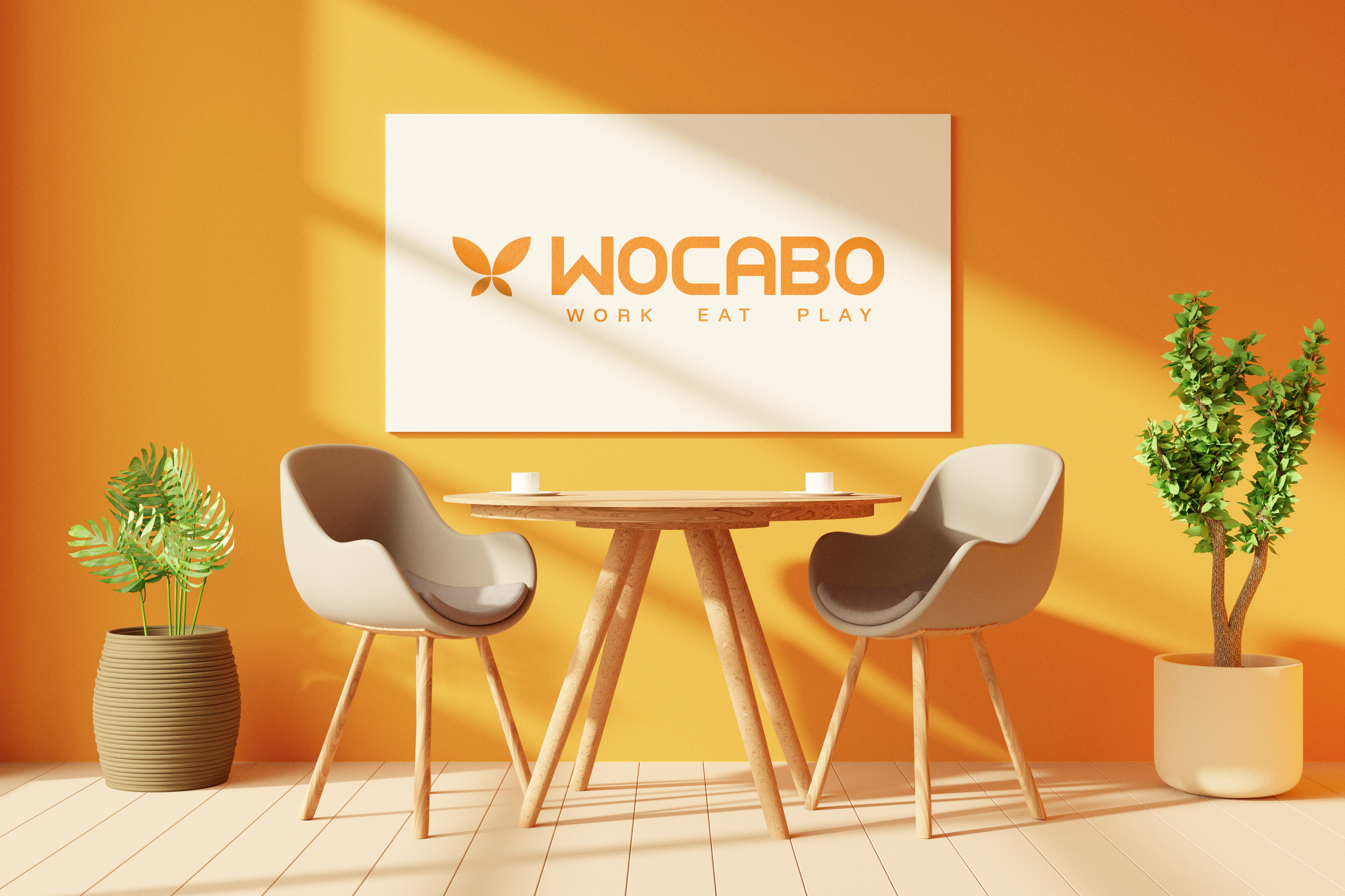
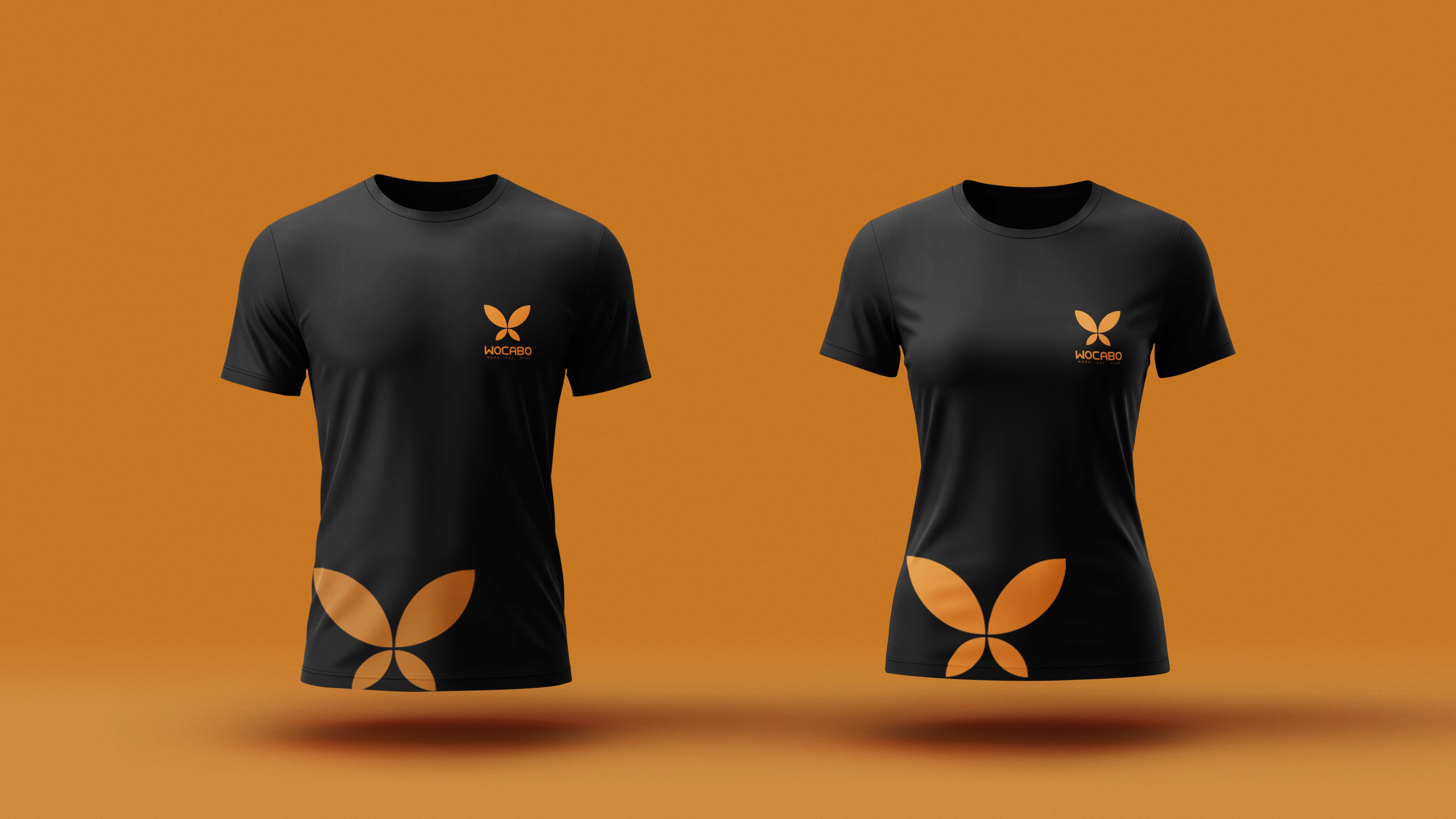
Our work with Wocabo focused on developing a brand identity that reflects its unique lounge cafe concept. Instead of using common cafe symbols, the brand identity was built around a butterfly motif. The butterfly represents creativity, freedom, and a relaxed atmospher, perfectly capturing Wocabo’s idea of a space where people can unwind, connect, and enjoy their time.
Our work with Wocabo focused on developing a brand identity that reflects its unique lounge cafe concept. Instead of using common cafe symbols, the brand identity was built around a butterfly motif. The butterfly represents creativity, freedom, and a relaxed atmospher, perfectly capturing Wocabo’s idea of a space where people can unwind, connect, and enjoy their time.
Our work with Wocabo focused on developing a brand identity that reflects its unique lounge cafe concept. Instead of using common cafe symbols, the brand identity was built around a butterfly motif. The butterfly represents creativity, freedom, and a relaxed atmospher, perfectly capturing Wocabo’s idea of a space where people can unwind, connect, and enjoy their time.
Our work with Wocabo focused on developing a brand identity that reflects its unique lounge cafe concept. Instead of using common cafe symbols, the brand identity was built around a butterfly motif. The butterfly represents creativity, freedom, and a relaxed atmospher, perfectly capturing Wocabo’s idea of a space where people can unwind, connect, and enjoy their time.
Our work with Wocabo focused on developing a brand identity that reflects its unique lounge cafe concept. Instead of using common cafe symbols, the brand identity was built around a butterfly motif. The butterfly represents creativity, freedom, and a relaxed atmospher, perfectly capturing Wocabo’s idea of a space where people can unwind, connect, and enjoy their time.

Mission
Mission
Mission
Mission
Mission
Our mission was to create a distinctive visual identity that differentiates Wocabo from conventional cafes while communicating its concept of combining work, food, and leisure in one inviting space.
Our mission was to create a distinctive visual identity that differentiates Wocabo from conventional cafes while communicating its concept of combining work, food, and leisure in one inviting space.
Our mission was to create a distinctive visual identity that differentiates Wocabo from conventional cafes while communicating its concept of combining work, food, and leisure in one inviting space.
Our mission was to create a distinctive visual identity that differentiates Wocabo from conventional cafes while communicating its concept of combining work, food, and leisure in one inviting space.
Our mission was to create a distinctive visual identity that differentiates Wocabo from conventional cafes while communicating its concept of combining work, food, and leisure in one inviting space.

Challenges
Challenges
Challenges
Challenges
Challenges
One of the main challenges was moving away from the typical visual language of cafe branding and introducing a natural element like a butterfly into the identity. Translating such an organic form into a clean and recognizable brand symbol required careful exploration. Another key challenge was defining the butterfly’s shape so that it remained natural while still aligning with the culture and identity of a cafe and food space. Additionally, the client strongly the concept and direction of the butterfly, making the process highly collaborative.
One of the main challenges was moving away from the typical visual language of cafe branding and introducing a natural element like a butterfly into the identity. Translating such an organic form into a clean and recognizable brand symbol required careful exploration. Another key challenge was defining the butterfly’s shape so that it remained natural while still aligning with the culture and identity of a cafe and food space. Additionally, the client strongly the concept and direction of the butterfly, making the process highly collaborative.
One of the main challenges was moving away from the typical visual language of cafe branding and introducing a natural element like a butterfly into the identity. Translating such an organic form into a clean and recognizable brand symbol required careful exploration. Another key challenge was defining the butterfly’s shape so that it remained natural while still aligning with the culture and identity of a cafe and food space. Additionally, the client strongly the concept and direction of the butterfly, making the process highly collaborative.
One of the main challenges was moving away from the typical visual language of cafe branding and introducing a natural element like a butterfly into the identity. Translating such an organic form into a clean and recognizable brand symbol required careful exploration. Another key challenge was defining the butterfly’s shape so that it remained natural while still aligning with the culture and identity of a cafe and food space. Additionally, the client strongly the concept and direction of the butterfly, making the process highly collaborative.
One of the main challenges was moving away from the typical visual language of cafe branding and introducing a natural element like a butterfly into the identity. Translating such an organic form into a clean and recognizable brand symbol required careful exploration. Another key challenge was defining the butterfly’s shape so that it remained natural while still aligning with the culture and identity of a cafe and food space. Additionally, the client strongly the concept and direction of the butterfly, making the process highly collaborative.


Conclusion
Conclusion
Conclusion
Conclusion
Conclusion
One of the main challenges was moving away from the typical visual language of cafe branding and introducing a natural element like a butterfly into the identity. Translating such an organic form into a clean and recognizable brand symbol required careful exploration. Another key challenge was defining the butterfly’s shape so that it remained natural while still aligning with the culture and identity of a cafe and food space. Additionally, the client strongly the concept and direction of the butterfly, making the process highly collaborative.
One of the main challenges was moving away from the typical visual language of cafe branding and introducing a natural element like a butterfly into the identity. Translating such an organic form into a clean and recognizable brand symbol required careful exploration. Another key challenge was defining the butterfly’s shape so that it remained natural while still aligning with the culture and identity of a cafe and food space. Additionally, the client strongly the concept and direction of the butterfly, making the process highly collaborative.
One of the main challenges was moving away from the typical visual language of cafe branding and introducing a natural element like a butterfly into the identity. Translating such an organic form into a clean and recognizable brand symbol required careful exploration. Another key challenge was defining the butterfly’s shape so that it remained natural while still aligning with the culture and identity of a cafe and food space. Additionally, the client strongly the concept and direction of the butterfly, making the process highly collaborative.
One of the main challenges was moving away from the typical visual language of cafe branding and introducing a natural element like a butterfly into the identity. Translating such an organic form into a clean and recognizable brand symbol required careful exploration. Another key challenge was defining the butterfly’s shape so that it remained natural while still aligning with the culture and identity of a cafe and food space. Additionally, the client strongly the concept and direction of the butterfly, making the process highly collaborative.
One of the main challenges was moving away from the typical visual language of cafe branding and introducing a natural element like a butterfly into the identity. Translating such an organic form into a clean and recognizable brand symbol required careful exploration. Another key challenge was defining the butterfly’s shape so that it remained natural while still aligning with the culture and identity of a cafe and food space. Additionally, the client strongly the concept and direction of the butterfly, making the process highly collaborative.
Conclusion
Conclusion
Conclusion
Conclusion
Conclusion
One of the main challenges was moving away from the typical visual language of cafe branding and introducing a natural element like a butterfly into the identity. Translating such an organic form into a clean and recognizable brand symbol required careful exploration. Another key challenge was defining the butterfly’s shape so that it remained natural while still aligning with the culture and identity of a cafe and food space. Additionally, the client strongly the concept and direction of the butterfly, making the process highly collaborative.
One of the main challenges was moving away from the typical visual language of cafe branding and introducing a natural element like a butterfly into the identity. Translating such an organic form into a clean and recognizable brand symbol required careful exploration. Another key challenge was defining the butterfly’s shape so that it remained natural while still aligning with the culture and identity of a cafe and food space. Additionally, the client strongly the concept and direction of the butterfly, making the process highly collaborative.
One of the main challenges was moving away from the typical visual language of cafe branding and introducing a natural element like a butterfly into the identity. Translating such an organic form into a clean and recognizable brand symbol required careful exploration. Another key challenge was defining the butterfly’s shape so that it remained natural while still aligning with the culture and identity of a cafe and food space. Additionally, the client strongly the concept and direction of the butterfly, making the process highly collaborative.
One of the main challenges was moving away from the typical visual language of cafe branding and introducing a natural element like a butterfly into the identity. Translating such an organic form into a clean and recognizable brand symbol required careful exploration. Another key challenge was defining the butterfly’s shape so that it remained natural while still aligning with the culture and identity of a cafe and food space. Additionally, the client strongly the concept and direction of the butterfly, making the process highly collaborative.
One of the main challenges was moving away from the typical visual language of cafe branding and introducing a natural element like a butterfly into the identity. Translating such an organic form into a clean and recognizable brand symbol required careful exploration. Another key challenge was defining the butterfly’s shape so that it remained natural while still aligning with the culture and identity of a cafe and food space. Additionally, the client strongly the concept and direction of the butterfly, making the process highly collaborative.
Are you Ready to
Collabrate with us?
Dial us
Are you Ready to
Collabrate with us?
Dial us
Are you Ready to
Collabrate with us?
Dial us
Are you Ready to
Collabrate with us?
Dial us