
Modern Logo Design for Foira
Modern Logo Design for Foira
Modern Logo Design for Foira
Modern Logo Design for Foira
Modern Logo Design for Foira
Client
Client
Client
Client
Foira
Foira
Foira
Foira
Foira
Category
Category
Category
Category
Branding
Branding
Branding
Branding
Branding
Date
Date
Date
Date
Our Value
Our Value
Our Value
Our Value
Our goal was to design a logo that would represent Foira’s modern, manufacturing-driven business while emphasizing their ability to mould anything. The logo needed to be simple, modern, and recognizable, aligning with their reputation for reliability and forward-thinking solutions.
Our goal was to design a logo that would represent Foira’s modern, manufacturing-driven business while emphasizing their ability to mould anything. The logo needed to be simple, modern, and recognizable, aligning with their reputation for reliability and forward-thinking solutions.
Our goal was to design a logo that would represent Foira’s modern, manufacturing-driven business while emphasizing their ability to mould anything. The logo needed to be simple, modern, and recognizable, aligning with their reputation for reliability and forward-thinking solutions.
Our goal was to design a logo that would represent Foira’s modern, manufacturing-driven business while emphasizing their ability to mould anything. The logo needed to be simple, modern, and recognizable, aligning with their reputation for reliability and forward-thinking solutions.
Our goal was to design a logo that would represent Foira’s modern, manufacturing-driven business while emphasizing their ability to mould anything. The logo needed to be simple, modern, and recognizable, aligning with their reputation for reliability and forward-thinking solutions.

Mission
Mission
Mission
Mission
Mission
The mission was to create a clean and minimalistic logo that reflected Foira’s industry leadership and versatile capabilities. The brand identity had to communicate professionalism, innovation, and robustness while staying timeless and simple.
The mission was to create a clean and minimalistic logo that reflected Foira’s industry leadership and versatile capabilities. The brand identity had to communicate professionalism, innovation, and robustness while staying timeless and simple.
The mission was to create a clean and minimalistic logo that reflected Foira’s industry leadership and versatile capabilities. The brand identity had to communicate professionalism, innovation, and robustness while staying timeless and simple.
The mission was to create a clean and minimalistic logo that reflected Foira’s industry leadership and versatile capabilities. The brand identity had to communicate professionalism, innovation, and robustness while staying timeless and simple.
The mission was to create a clean and minimalistic logo that reflected Foira’s industry leadership and versatile capabilities. The brand identity had to communicate professionalism, innovation, and robustness while staying timeless and simple.

Challenges
Challenges
Challenges
Challenges
Challenges
Unlike some clients, Foira’s industry was familiar to us, and it wasn’t a new niche to explore. The client was very flexible to work with, allowing us to take creative control and come up with unique designs. This flexibility made it easier for us to bring our ideas to life, but the challenge was to ensure the logo encapsulated Foira's ability to mould anything while still keeping it simple and modern.
Unlike some clients, Foira’s industry was familiar to us, and it wasn’t a new niche to explore. The client was very flexible to work with, allowing us to take creative control and come up with unique designs. This flexibility made it easier for us to bring our ideas to life, but the challenge was to ensure the logo encapsulated Foira's ability to mould anything while still keeping it simple and modern.
Unlike some clients, Foira’s industry was familiar to us, and it wasn’t a new niche to explore. The client was very flexible to work with, allowing us to take creative control and come up with unique designs. This flexibility made it easier for us to bring our ideas to life, but the challenge was to ensure the logo encapsulated Foira's ability to mould anything while still keeping it simple and modern.
Unlike some clients, Foira’s industry was familiar to us, and it wasn’t a new niche to explore. The client was very flexible to work with, allowing us to take creative control and come up with unique designs. This flexibility made it easier for us to bring our ideas to life, but the challenge was to ensure the logo encapsulated Foira's ability to mould anything while still keeping it simple and modern.
Unlike some clients, Foira’s industry was familiar to us, and it wasn’t a new niche to explore. The client was very flexible to work with, allowing us to take creative control and come up with unique designs. This flexibility made it easier for us to bring our ideas to life, but the challenge was to ensure the logo encapsulated Foira's ability to mould anything while still keeping it simple and modern.


Conclusion
Conclusion
Conclusion
Conclusion
Conclusion
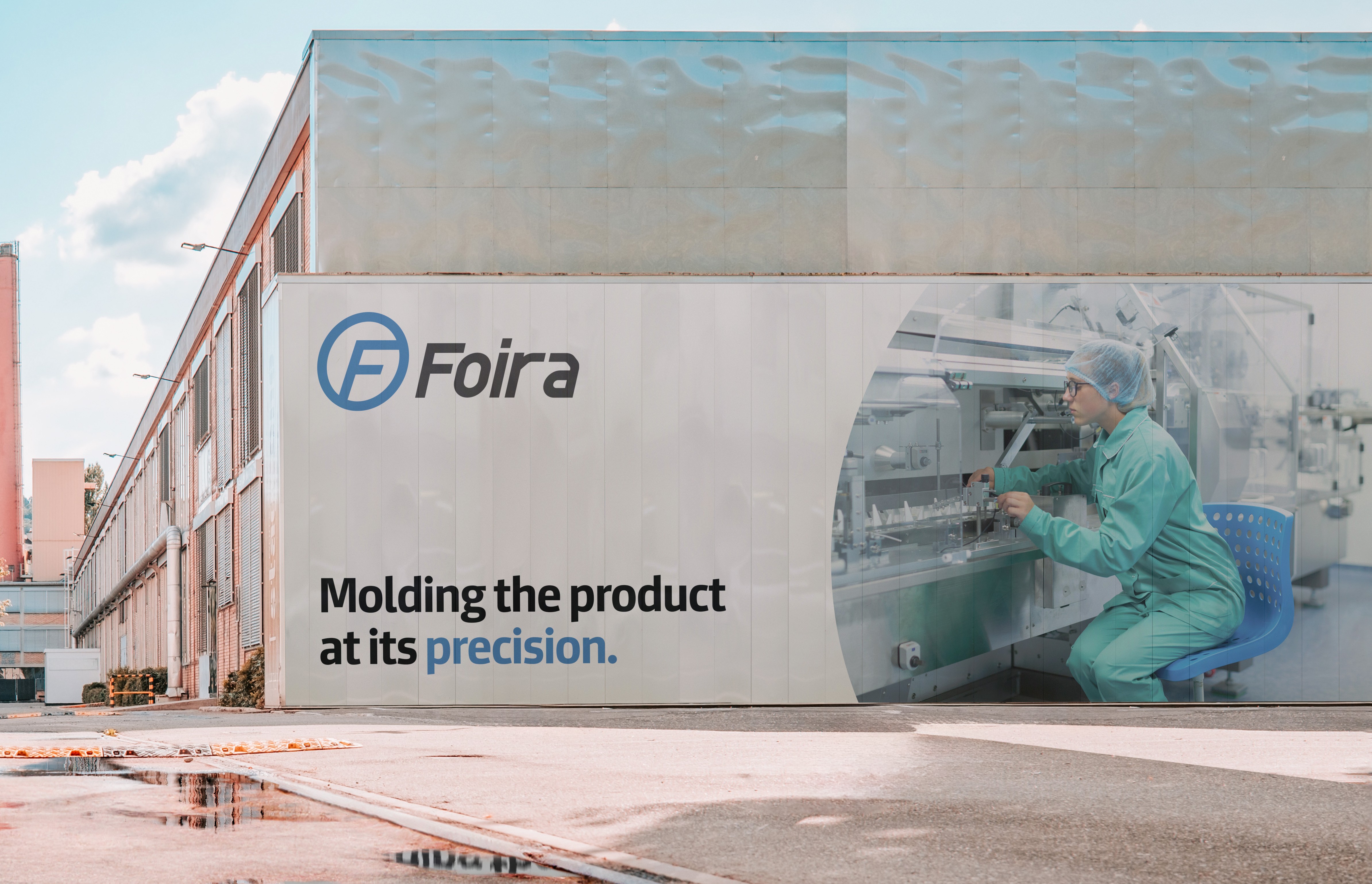
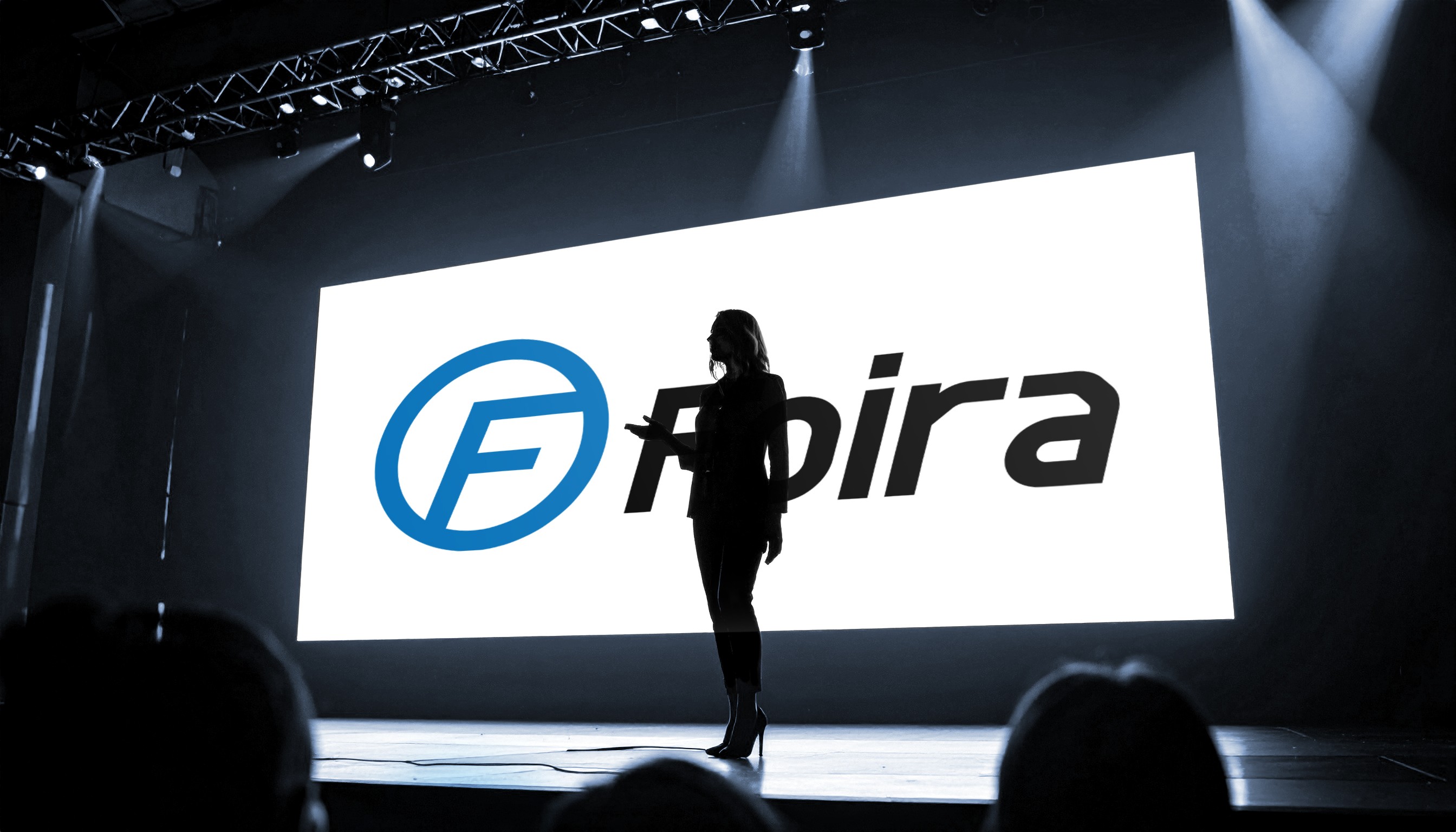
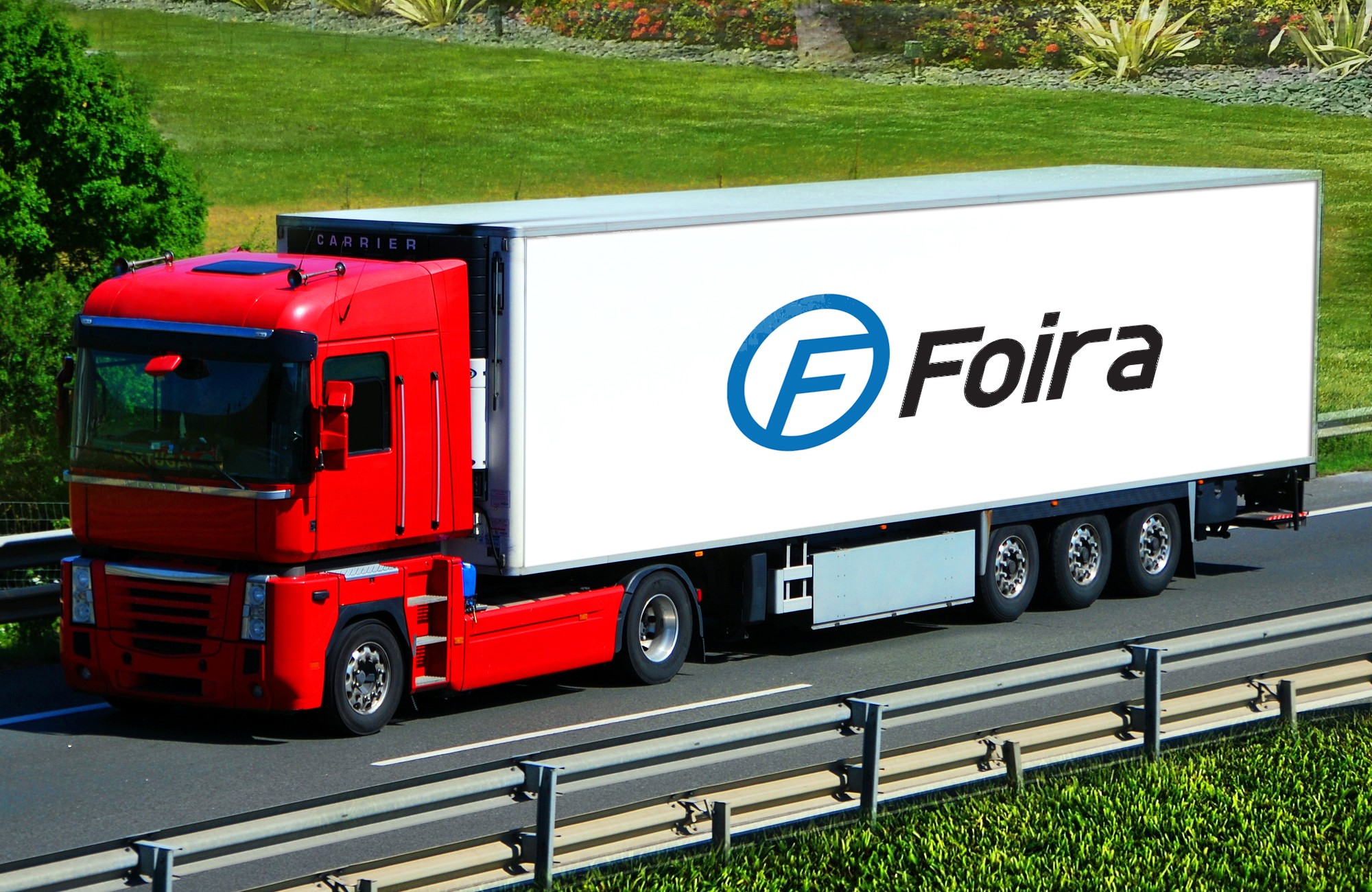
We successfully designed a modern and minimalist logo that is both simple and easily recognizable. The logo features the letter "F" within an ellipse, symbolizing the Earth and the concept of moulding. The "F" denotes moulding, and the design reflects that Foira can mould anything. The blue color was chosen to represent robustness, professionalism, functionality, and a futuristic approach. The design not only reflects Foira’s capabilities but also establishes them as a strong, professional presence in the manufacturing industry.
We successfully designed a modern and minimalist logo that is both simple and easily recognizable. The logo features the letter "F" within an ellipse, symbolizing the Earth and the concept of moulding. The "F" denotes moulding, and the design reflects that Foira can mould anything. The blue color was chosen to represent robustness, professionalism, functionality, and a futuristic approach. The design not only reflects Foira’s capabilities but also establishes them as a strong, professional presence in the manufacturing industry.
We successfully designed a modern and minimalist logo that is both simple and easily recognizable. The logo features the letter "F" within an ellipse, symbolizing the Earth and the concept of moulding. The "F" denotes moulding, and the design reflects that Foira can mould anything. The blue color was chosen to represent robustness, professionalism, functionality, and a futuristic approach. The design not only reflects Foira’s capabilities but also establishes them as a strong, professional presence in the manufacturing industry.
We successfully designed a modern and minimalist logo that is both simple and easily recognizable. The logo features the letter "F" within an ellipse, symbolizing the Earth and the concept of moulding. The "F" denotes moulding, and the design reflects that Foira can mould anything. The blue color was chosen to represent robustness, professionalism, functionality, and a futuristic approach. The design not only reflects Foira’s capabilities but also establishes them as a strong, professional presence in the manufacturing industry.
We successfully designed a modern and minimalist logo that is both simple and easily recognizable. The logo features the letter "F" within an ellipse, symbolizing the Earth and the concept of moulding. The "F" denotes moulding, and the design reflects that Foira can mould anything. The blue color was chosen to represent robustness, professionalism, functionality, and a futuristic approach. The design not only reflects Foira’s capabilities but also establishes them as a strong, professional presence in the manufacturing industry.
Conclusion
Conclusion
Conclusion
Conclusion
Conclusion
We successfully designed a modern and minimalist logo that is both simple and easily recognizable. The logo features the letter "F" within an ellipse, symbolizing the Earth and the concept of moulding. The "F" denotes moulding, and the design reflects that Foira can mould anything. The blue color was chosen to represent robustness, professionalism, functionality, and a futuristic approach. The design not only reflects Foira’s capabilities but also establishes them as a strong, professional presence in the manufacturing industry.
We successfully designed a modern and minimalist logo that is both simple and easily recognizable. The logo features the letter "F" within an ellipse, symbolizing the Earth and the concept of moulding. The "F" denotes moulding, and the design reflects that Foira can mould anything. The blue color was chosen to represent robustness, professionalism, functionality, and a futuristic approach. The design not only reflects Foira’s capabilities but also establishes them as a strong, professional presence in the manufacturing industry.
We successfully designed a modern and minimalist logo that is both simple and easily recognizable. The logo features the letter "F" within an ellipse, symbolizing the Earth and the concept of moulding. The "F" denotes moulding, and the design reflects that Foira can mould anything. The blue color was chosen to represent robustness, professionalism, functionality, and a futuristic approach. The design not only reflects Foira’s capabilities but also establishes them as a strong, professional presence in the manufacturing industry.
We successfully designed a modern and minimalist logo that is both simple and easily recognizable. The logo features the letter "F" within an ellipse, symbolizing the Earth and the concept of moulding. The "F" denotes moulding, and the design reflects that Foira can mould anything. The blue color was chosen to represent robustness, professionalism, functionality, and a futuristic approach. The design not only reflects Foira’s capabilities but also establishes them as a strong, professional presence in the manufacturing industry.
We successfully designed a modern and minimalist logo that is both simple and easily recognizable. The logo features the letter "F" within an ellipse, symbolizing the Earth and the concept of moulding. The "F" denotes moulding, and the design reflects that Foira can mould anything. The blue color was chosen to represent robustness, professionalism, functionality, and a futuristic approach. The design not only reflects Foira’s capabilities but also establishes them as a strong, professional presence in the manufacturing industry.
Are you Ready to
Collabrate with us?
Dial us
Are you Ready to
Collabrate with us?
Dial us
Are you Ready to
Collabrate with us?
Dial us
Are you Ready to
Collabrate with us?
Dial us