

Nestfinity Logo Design Exploration
Nestfinity Logo Design Exploration
Nestfinity Logo Design Exploration
Nestfinity Logo Design Exploration
Nestfinity Logo Design Exploration
Client
Client
Client
Client
Nestfinity
Nestfinity
Nestfinity
Nestfinity
Nestfinity
Category
Category
Category
Category
Branding
Branding
Branding
Branding
Branding
Date
Date
Date
Date
Our Value
Our Value
Our Value
Our Value
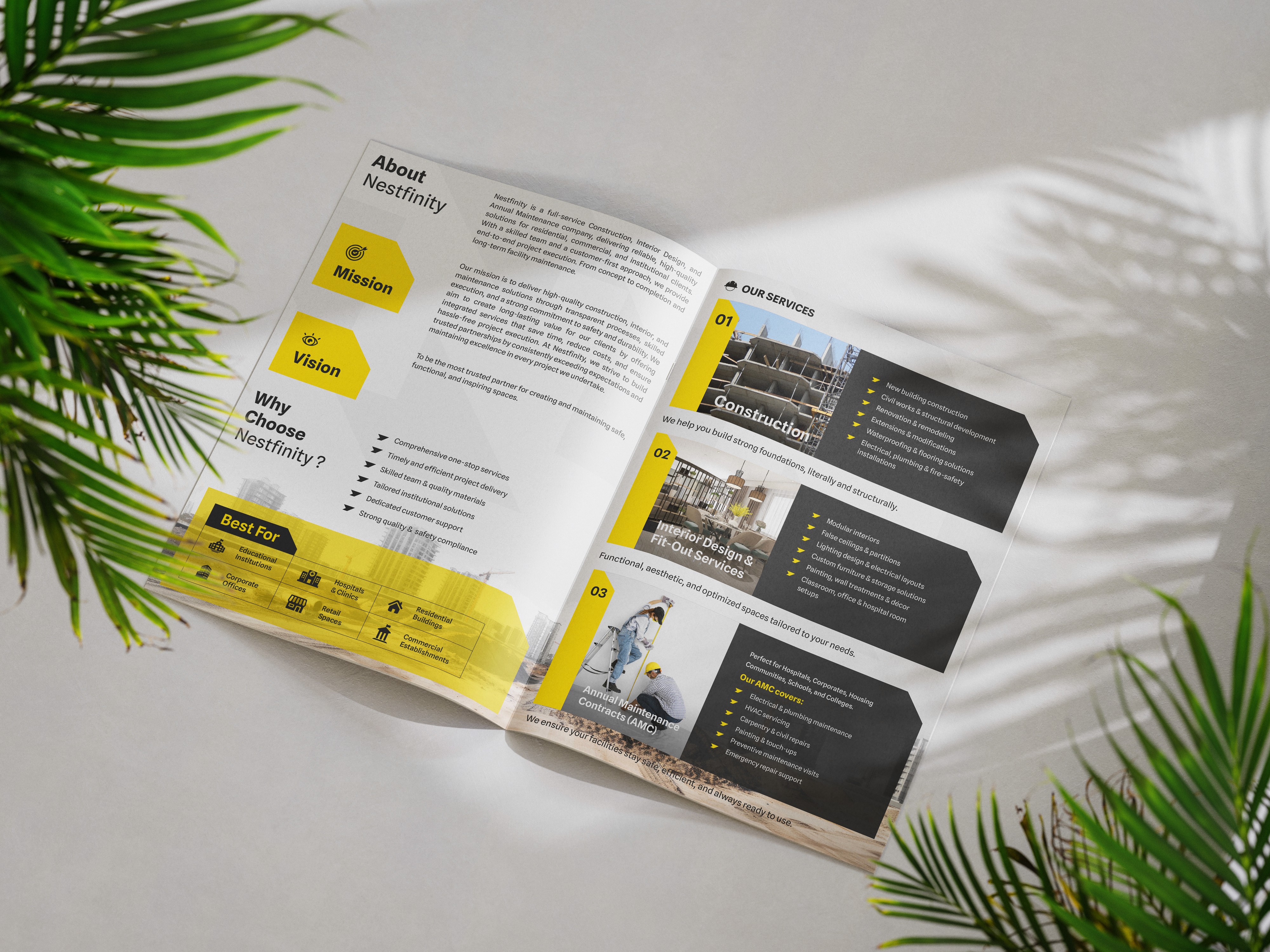
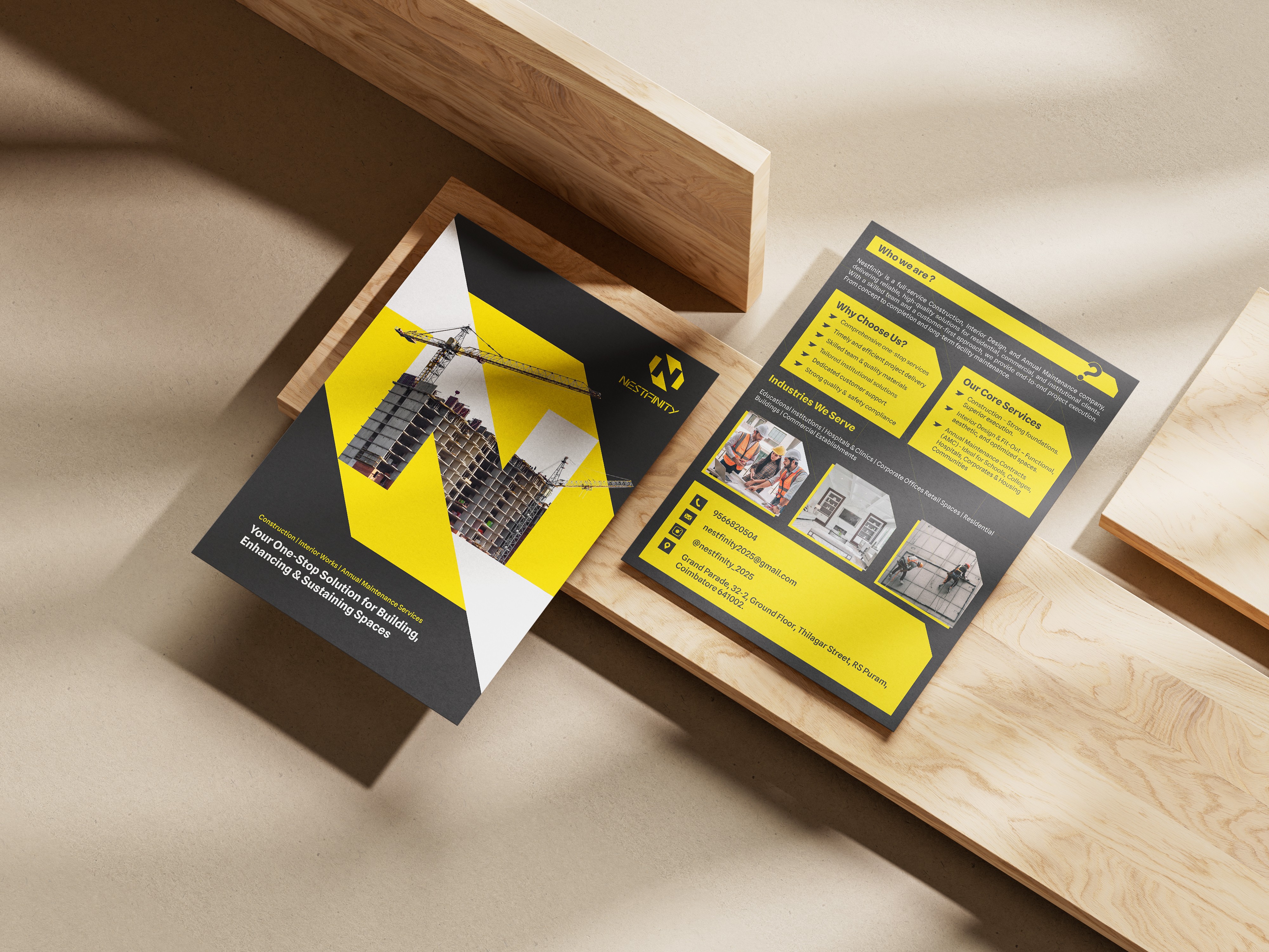
Our work with Nestfinity focused on creating a distinct and meaningful logo that reflects the company’s expertise in both construction and interior design. The final design integrates the letter “N” with a building structure, visually representing the company’s core services. This concept allows the logo to communicate the nature of the business at a glance while maintaining a clean and modern design style.
Our work with Nestfinity focused on creating a distinct and meaningful logo that reflects the company’s expertise in both construction and interior design. The final design integrates the letter “N” with a building structure, visually representing the company’s core services. This concept allows the logo to communicate the nature of the business at a glance while maintaining a clean and modern design style.
Our work with Nestfinity focused on creating a distinct and meaningful logo that reflects the company’s expertise in both construction and interior design. The final design integrates the letter “N” with a building structure, visually representing the company’s core services. This concept allows the logo to communicate the nature of the business at a glance while maintaining a clean and modern design style.
Our work with Nestfinity focused on creating a distinct and meaningful logo that reflects the company’s expertise in both construction and interior design. The final design integrates the letter “N” with a building structure, visually representing the company’s core services. This concept allows the logo to communicate the nature of the business at a glance while maintaining a clean and modern design style.
Our work with Nestfinity focused on creating a distinct and meaningful logo that reflects the company’s expertise in both construction and interior design. The final design integrates the letter “N” with a building structure, visually representing the company’s core services. This concept allows the logo to communicate the nature of the business at a glance while maintaining a clean and modern design style.


Mission
Mission
Mission
Mission
Mission
Our mission was to develop a strong and recognizable visual identity for Nestfinity that represents their work in construction and interiors. The goal was to design a logo that is simple, modern, and concept-driven, ensuring the brand stands out while clearly reflecting its industry and services.
Our mission was to develop a strong and recognizable visual identity for Nestfinity that represents their work in construction and interiors. The goal was to design a logo that is simple, modern, and concept-driven, ensuring the brand stands out while clearly reflecting its industry and services.
Our mission was to develop a strong and recognizable visual identity for Nestfinity that represents their work in construction and interiors. The goal was to design a logo that is simple, modern, and concept-driven, ensuring the brand stands out while clearly reflecting its industry and services.
Our mission was to develop a strong and recognizable visual identity for Nestfinity that represents their work in construction and interiors. The goal was to design a logo that is simple, modern, and concept-driven, ensuring the brand stands out while clearly reflecting its industry and services.
Our mission was to develop a strong and recognizable visual identity for Nestfinity that represents their work in construction and interiors. The goal was to design a logo that is simple, modern, and concept-driven, ensuring the brand stands out while clearly reflecting its industry and services.

Challenges
Challenges
Challenges
Challenges
Challenges
One of the key challenges was designing a logo that clearly represented both construction and interior services while incorporating the letter “N.” Initially, we explored concepts combining a symbol and wordmark, but later focused on a symbol-based approach. After creating and refining over 25 concepts, we finalized a design where a building structure forms the shape of the letter “N,” making the concept both meaningful and visually distinctive.
One of the key challenges was designing a logo that clearly represented both construction and interior services while incorporating the letter “N.” Initially, we explored concepts combining a symbol and wordmark, but later focused on a symbol-based approach. After creating and refining over 25 concepts, we finalized a design where a building structure forms the shape of the letter “N,” making the concept both meaningful and visually distinctive.
One of the key challenges was designing a logo that clearly represented both construction and interior services while incorporating the letter “N.” Initially, we explored concepts combining a symbol and wordmark, but later focused on a symbol-based approach. After creating and refining over 25 concepts, we finalized a design where a building structure forms the shape of the letter “N,” making the concept both meaningful and visually distinctive.
One of the key challenges was designing a logo that clearly represented both construction and interior services while incorporating the letter “N.” Initially, we explored concepts combining a symbol and wordmark, but later focused on a symbol-based approach. After creating and refining over 25 concepts, we finalized a design where a building structure forms the shape of the letter “N,” making the concept both meaningful and visually distinctive.
One of the key challenges was designing a logo that clearly represented both construction and interior services while incorporating the letter “N.” Initially, we explored concepts combining a symbol and wordmark, but later focused on a symbol-based approach. After creating and refining over 25 concepts, we finalized a design where a building structure forms the shape of the letter “N,” making the concept both meaningful and visually distinctive.

Conclusion
Conclusion
Conclusion
Conclusion
Conclusion
One of the key challenges was designing a logo that clearly represented both construction and interior services while incorporating the letter “N.” Initially, we explored concepts combining a symbol and wordmark, but later focused on a symbol-based approach. After creating and refining over 25 concepts, we finalized a design where a building structure forms the shape of the letter “N,” making the concept both meaningful and visually distinctive.
One of the key challenges was designing a logo that clearly represented both construction and interior services while incorporating the letter “N.” Initially, we explored concepts combining a symbol and wordmark, but later focused on a symbol-based approach. After creating and refining over 25 concepts, we finalized a design where a building structure forms the shape of the letter “N,” making the concept both meaningful and visually distinctive.
One of the key challenges was designing a logo that clearly represented both construction and interior services while incorporating the letter “N.” Initially, we explored concepts combining a symbol and wordmark, but later focused on a symbol-based approach. After creating and refining over 25 concepts, we finalized a design where a building structure forms the shape of the letter “N,” making the concept both meaningful and visually distinctive.
One of the key challenges was designing a logo that clearly represented both construction and interior services while incorporating the letter “N.” Initially, we explored concepts combining a symbol and wordmark, but later focused on a symbol-based approach. After creating and refining over 25 concepts, we finalized a design where a building structure forms the shape of the letter “N,” making the concept both meaningful and visually distinctive.
One of the key challenges was designing a logo that clearly represented both construction and interior services while incorporating the letter “N.” Initially, we explored concepts combining a symbol and wordmark, but later focused on a symbol-based approach. After creating and refining over 25 concepts, we finalized a design where a building structure forms the shape of the letter “N,” making the concept both meaningful and visually distinctive.

Conclusion
Conclusion
Conclusion
Conclusion
Conclusion
One of the key challenges was designing a logo that clearly represented both construction and interior services while incorporating the letter “N.” Initially, we explored concepts combining a symbol and wordmark, but later focused on a symbol-based approach. After creating and refining over 25 concepts, we finalized a design where a building structure forms the shape of the letter “N,” making the concept both meaningful and visually distinctive.
One of the key challenges was designing a logo that clearly represented both construction and interior services while incorporating the letter “N.” Initially, we explored concepts combining a symbol and wordmark, but later focused on a symbol-based approach. After creating and refining over 25 concepts, we finalized a design where a building structure forms the shape of the letter “N,” making the concept both meaningful and visually distinctive.
One of the key challenges was designing a logo that clearly represented both construction and interior services while incorporating the letter “N.” Initially, we explored concepts combining a symbol and wordmark, but later focused on a symbol-based approach. After creating and refining over 25 concepts, we finalized a design where a building structure forms the shape of the letter “N,” making the concept both meaningful and visually distinctive.
One of the key challenges was designing a logo that clearly represented both construction and interior services while incorporating the letter “N.” Initially, we explored concepts combining a symbol and wordmark, but later focused on a symbol-based approach. After creating and refining over 25 concepts, we finalized a design where a building structure forms the shape of the letter “N,” making the concept both meaningful and visually distinctive.
One of the key challenges was designing a logo that clearly represented both construction and interior services while incorporating the letter “N.” Initially, we explored concepts combining a symbol and wordmark, but later focused on a symbol-based approach. After creating and refining over 25 concepts, we finalized a design where a building structure forms the shape of the letter “N,” making the concept both meaningful and visually distinctive.
Are you Ready to
Collabrate with us?
Dial us
Are you Ready to
Collabrate with us?
Dial us
Are you Ready to
Collabrate with us?
Dial us
Are you Ready to
Collabrate with us?
Dial us