
Table of Contents
The Same Purpose. A Stronger Presence
The New Fokxx: What's Changing and What Stays the Same
Orange Represents Bold Strategies
Behind the Brand: How a Branding Agency Brands Itself
The Strategy Before the Design
From Local to Pan-World
Bring the Vibe Through Meaningful Work
Our New Typography or Font Selection
How We Rebuilt Our Website from the Ground Up
More Than a New Look
The Same Purpose. A Stronger Presence.
We have always believed that growth comes from strategy, creativity, and execution. Today, we're introducing a new identity that better reflects the company we've become, and the future we're building.
The New Fokxx: What's Changing and What Stays the Same
Our visual identity, messaging, and website are new. Our people, our process, and our commitment to every client are exactly the same. The rebrand is an evolution — not a reinvention — and existing clients will notice the upgrade without losing anything they relied on.
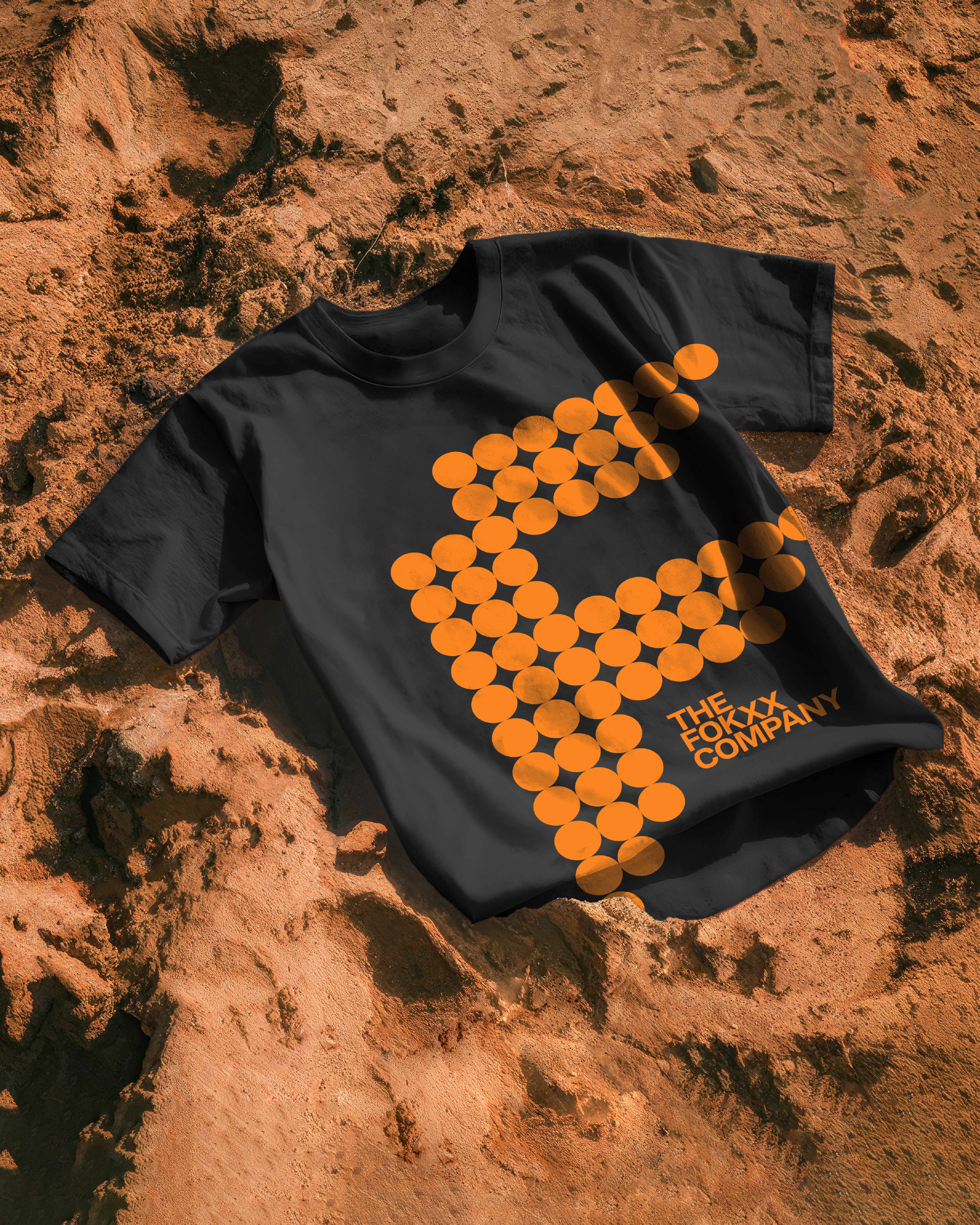
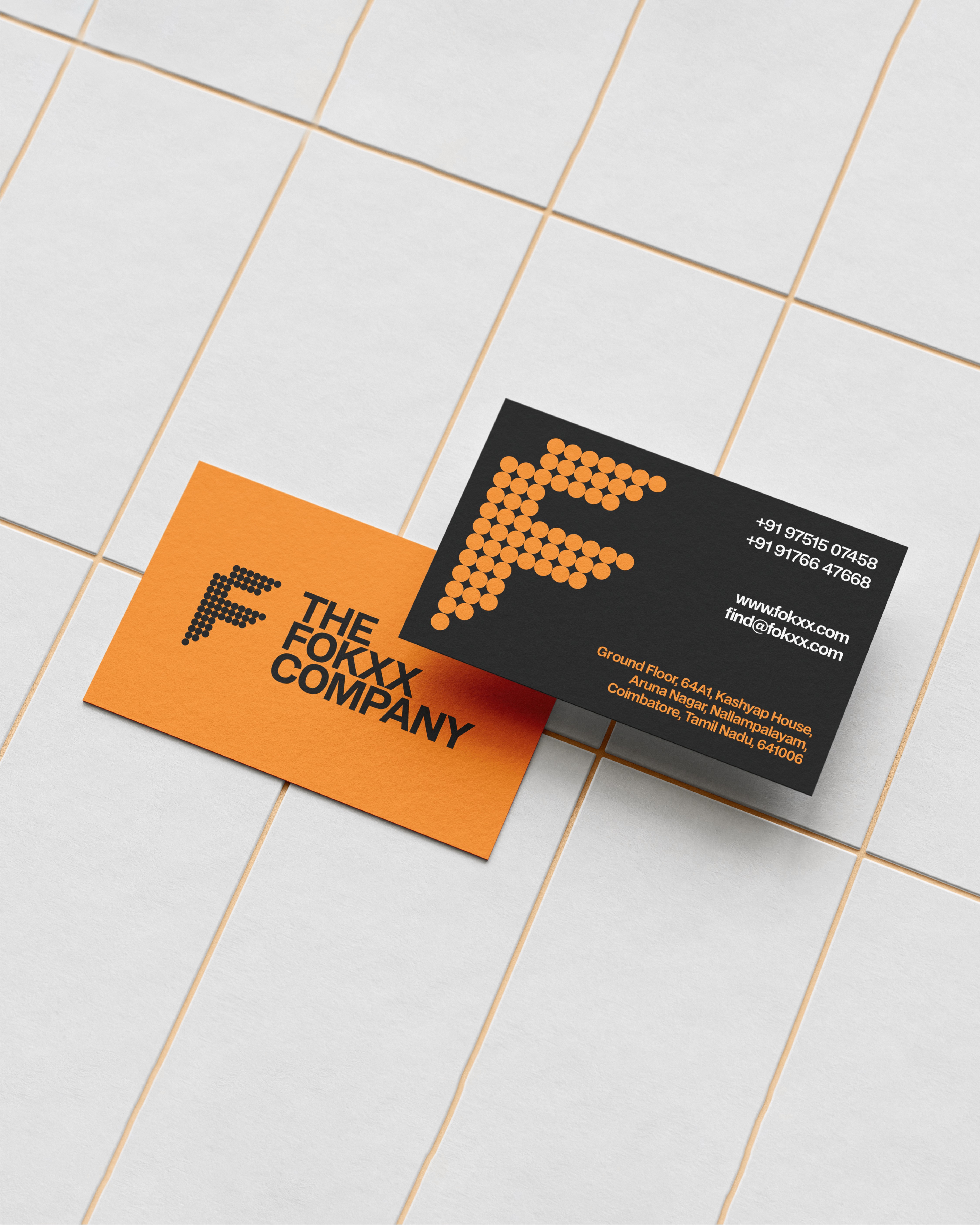
Orange Represents Bold Strategies.
The new orange identity symbolizes confidence, ambition, and bold strategic thinking. It reflects our commitment to helping brands move forward with clarity and purpose.

Behind the Brand: How a Branding Agency Brands Itself
Branding yourself is harder than branding a client — every decision is personal. We ran our own rebrand through the same structured process we use for clients: positioning workshops, honest internal debates, and a test for every choice: does this feel true? The answer had to be yes before anything moved forward.

The Strategy Before the Design
Before we opened a single design tool, we spent weeks in strategy — mapping our audience, defining our positioning, and writing out the beliefs that underpin everything we do. Strategy is the invisible architecture of every great brand, and ours was no exception.

From Local to Pan-World
The Fokxx Company was born in Coimbatore as the Marketing agency, Branding agency, and Design agency , but it was never meant to stay small. The rebrand is our public signal that we're ready for the next phase — serving founders and brands across India and internationally, with the same creative precision we've built our reputation on.
esults are not accidental. They come from the combination of research, creativity, strategy, and execution. Our mission is to consistently deliver impressive results that create long-term value for the brands we serve.
Our New Typography or Font Selection
As a new Typeface for The Fokxx Company we have selected the BDO Grotesk famly as a go to Typography which provides bold, clear, minimal, and clarity for clients to go through vividly.

How We Rebuilt Our Website from the Ground Up
We chose Framer for design control, rewrote every page with SEO built in from day one, and cut every word that didn't earn its place. The result is a site that ranks, converts, and accurately represents what Fokxx can do for a brand.
More Than a New Look.
This rebrand is a reflection of our evolution. A stronger identity. Deeper competitive analysis. Elevated strategic thinking. Upgraded execution. Impressive results. The same commitment to excellence, and now expressed with even greater clarity and confidence.